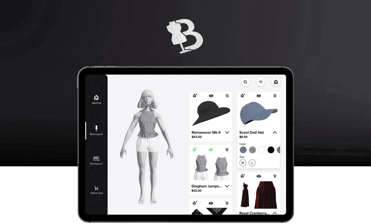
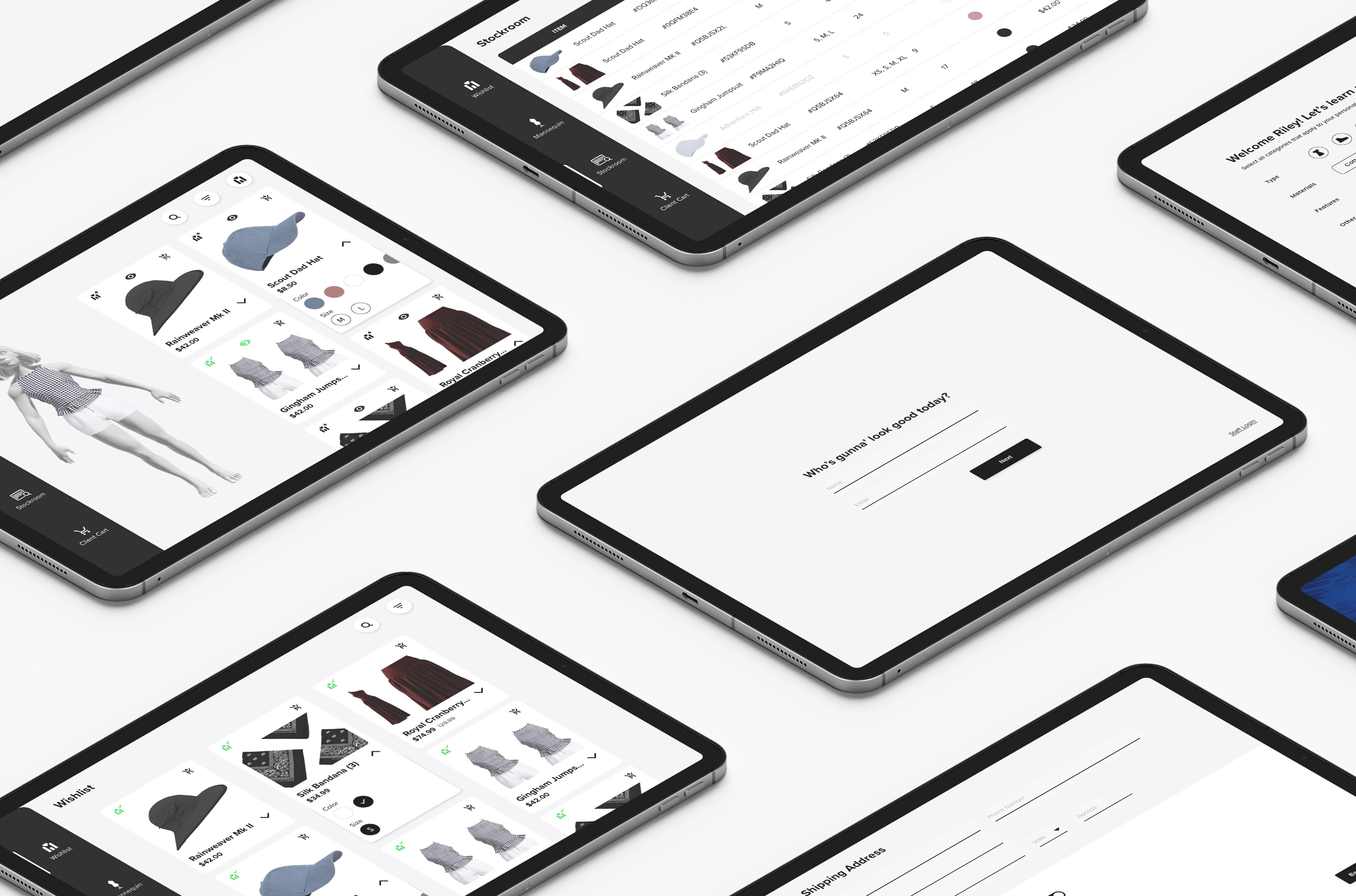
A digital solution bridging boutique store stylists and the digital worlds.
Boutique stylists often struggle with helping clients find the correct articles of clothing due to limited store stock, colors & sizes available, and lack of a mobile program to keep track of client preferences.
Let's fix that.
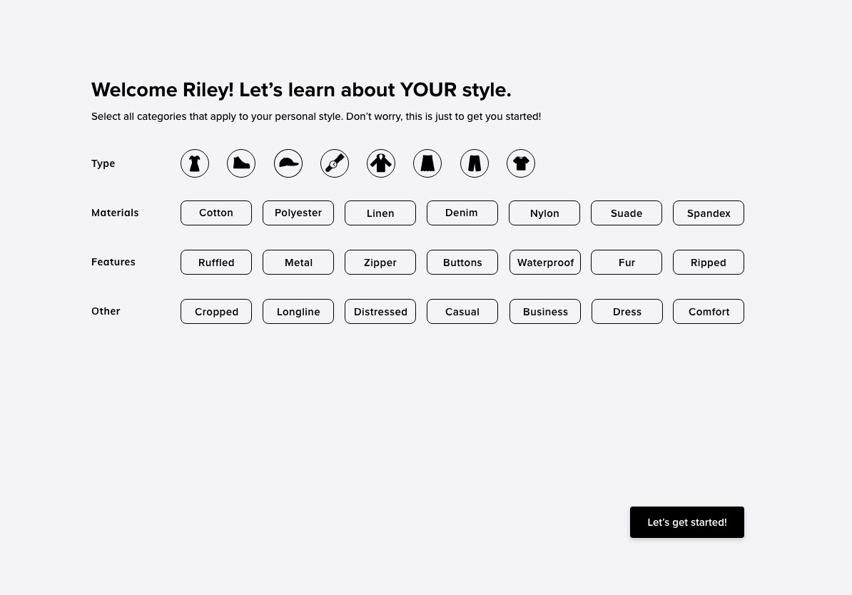
Desired Features
Two close friends have styled clients for multiple boutique companies, in-store and online. My timeframe for the projects was brief, so my user interviews were short but thorough. The key information gathered was:
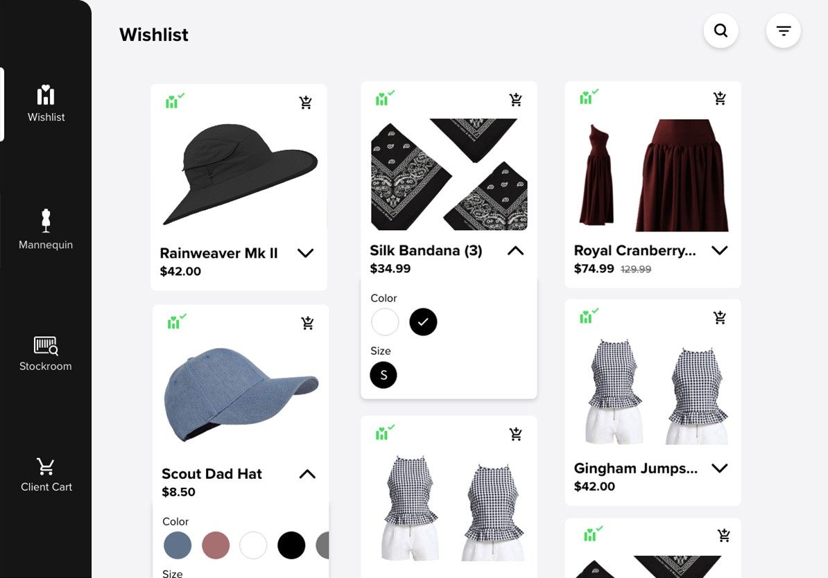
Wishlist
Include a 'WishList' Section so stylists can save pieces for each client
Information Heavy
Stylists should be able to see all product information easily - picture, color, sizes, name, price, stock.
Accessories
Inclusion of accessories like watches, jewelry, hats, and scarfs so stylists can create complete outfits.
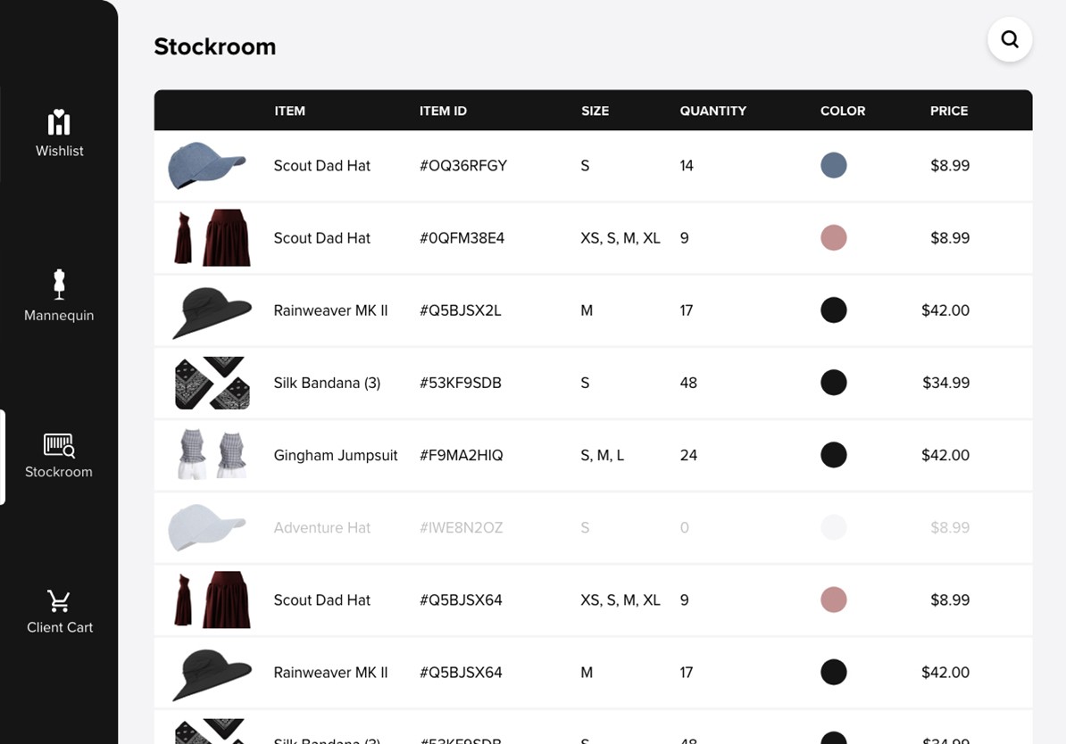
Stockroom
Include a feature letting the stylist know what is in stock at the store
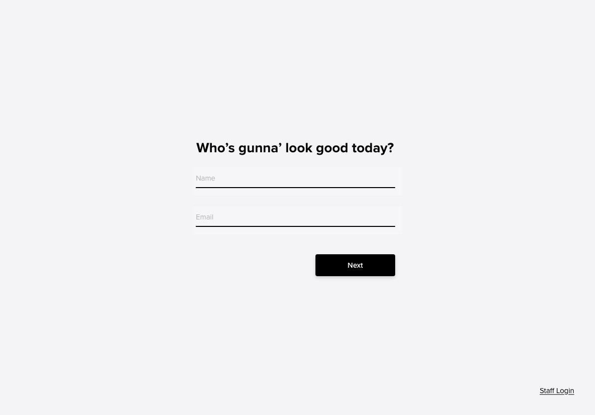
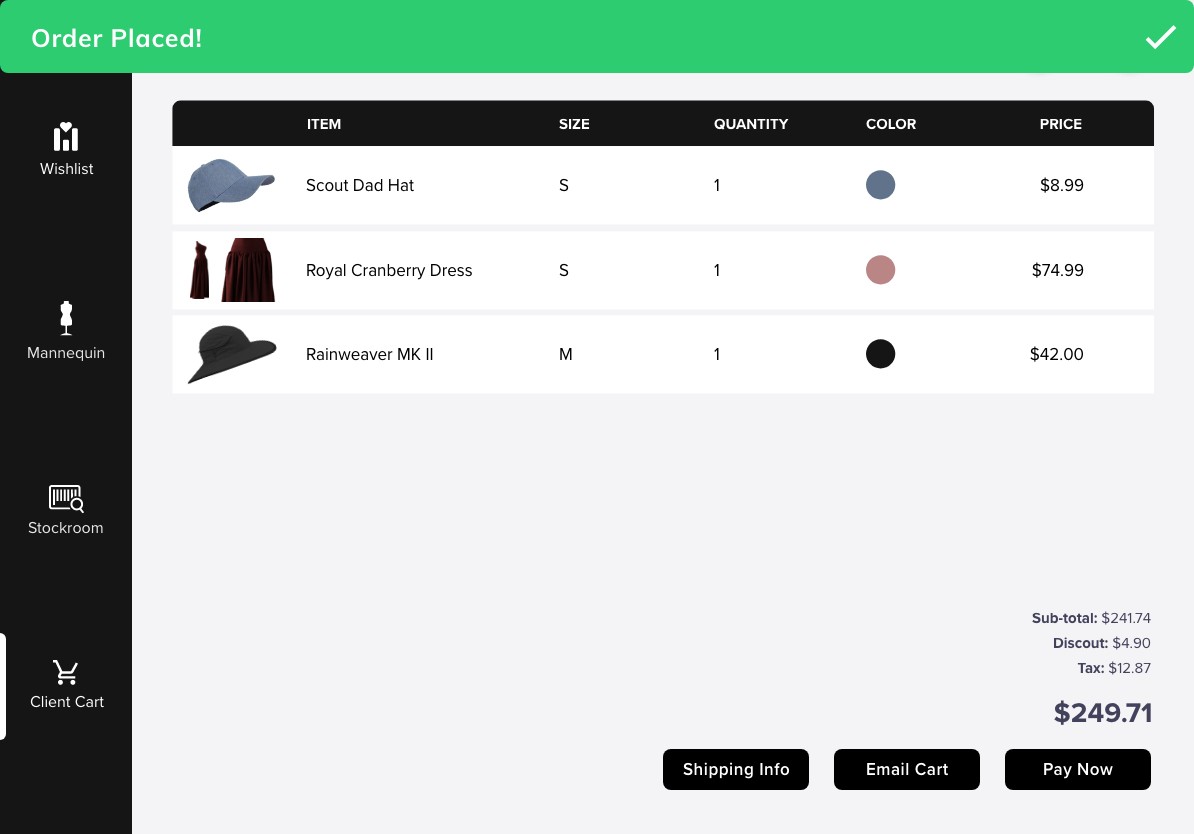
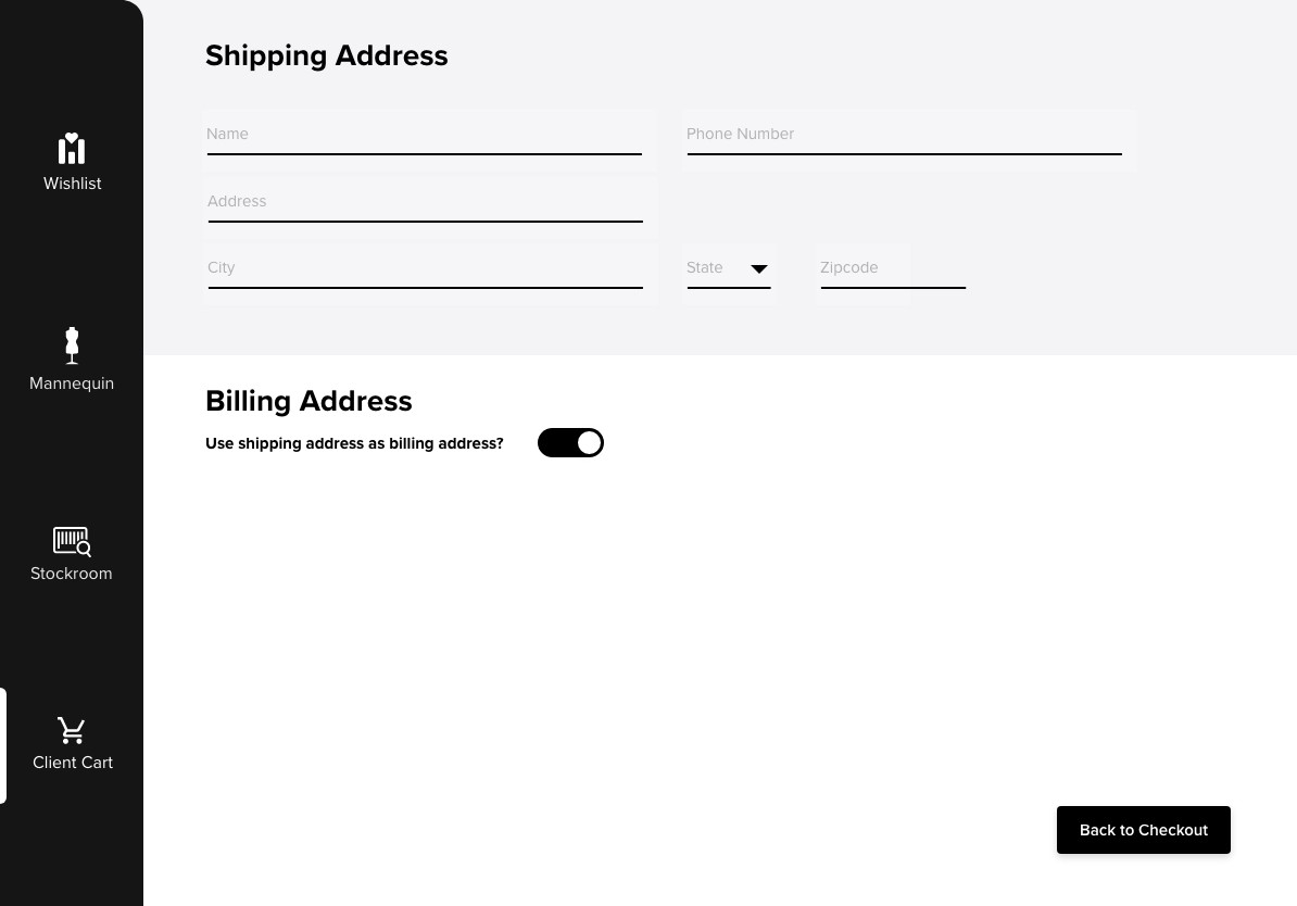
Ship to Consumer
Ability for client to order items to their house - not the boutique store itself
See in Context
Ability to view any combination of clothes on a Mannequin or person, not just flat clothing images.
Competitive Analysis
To form the information hierarchy of Mannequin's product cards, I analyzed three industry-leading retailers's tablet-based apps to determine currently functioning designs: Amazon, Walmart, & Uniqlo. Each retailer emphasized different factors, leading me to decide how I wanted Mannequin's cards to display this info:
Product photo
Color options
Brand name
Product title
Rating
Price
Shipping information
Special tag (best seller)- Availability
Sizes
PROMINENT 'sale' tag
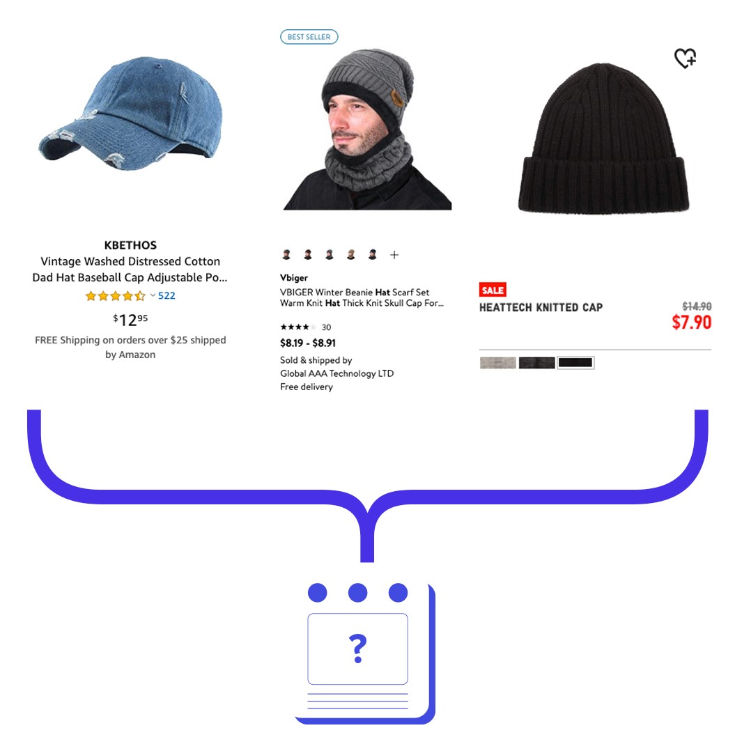
Analysis of similar retailers
Product Card Iterations
I dedicated an entire day to just perfecting the product card, as these would make the stylist's job not only easier, but also engage the client. These are all of the iterations explored, considering card shape, and visual hierarchy.
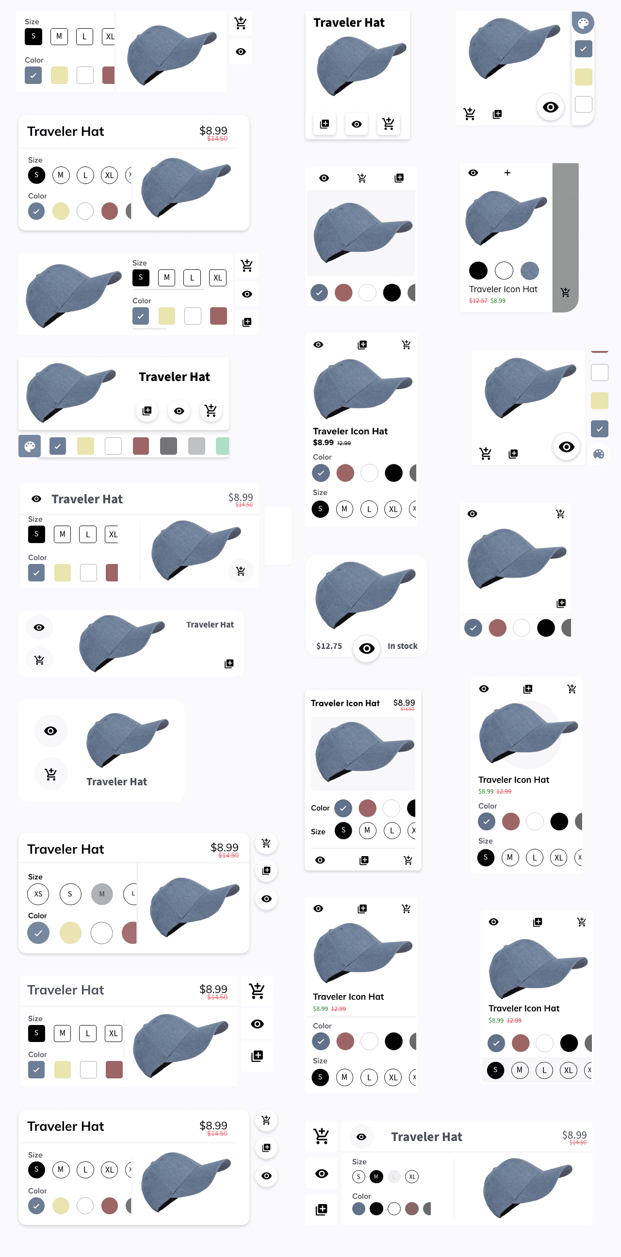
Iterations on Iterations on Iterations on... you get it
Winner of Card Royale
I chose to utilize an expandable card to display primary information initially and secondary information in a dropdown.Not only did the cards have to convey information about the product, but also allow stylists to take action. Relevant Iconography was vital to avoid labels & allow a clean card interface.
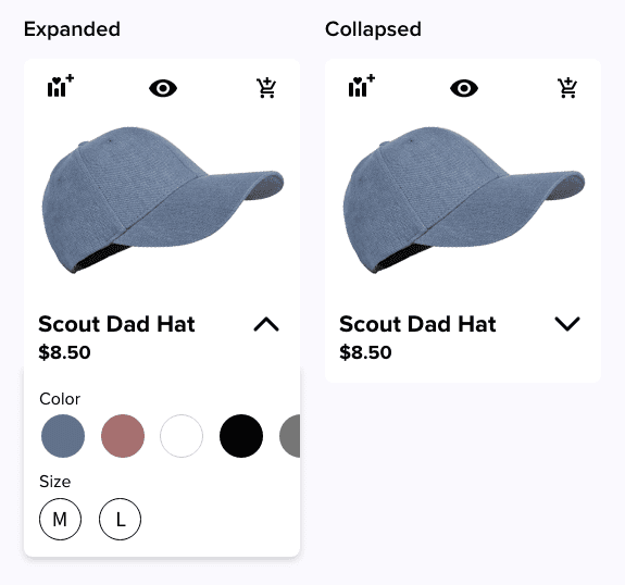
The most user-friendly and visually appealing card styles of the bunch
Small animations, big impact.
It's the small animations that make this app feel luxurious and clean. Small visual changes, such as animating checks over the 'add to wishlist' icon in addition to a color change give user feedback for actions taken.

Icon Animations
A digital solution bridging boutique store stylists and the digital worlds.
Boutique stylists often struggle with helping clients find the correct articles of clothing due to limited store stock, colors & sizes available, and lack of a mobile program to keep track of client preferences.
Let's fix that.
Desired Features
Two close friends have styled clients for multiple boutique companies, in-store and online. My timeframe for the projects was brief, so my user interviews were short but thorough. The key information gathered was:
Wishlist
Include a 'WishList' Section so stylists can save pieces for each client
Information Heavy
Stylists should be able to see all product information easily - picture, color, sizes, name, price, stock.
Accessories
Inclusion of accessories like watches, jewelry, hats, and scarfs so stylists can create complete outfits.
Stockroom
Include a feature letting the stylist know what is in stock at the store
Ship to Consumer
Ability for client to order items to their house - not the boutique store itself
See in Context
Ability to view any combination of clothes on a Mannequin or person, not just flat clothing images.
Competitive Analysis
To form the information hierarchy of Mannequin's product cards, I analyzed three industry-leading retailers's tablet-based apps to determine currently functioning designs: Amazon, Walmart, & Uniqlo. Each retailer emphasized different factors, leading me to decide how I wanted Mannequin's cards to display this info:
Product photo
Color options
Brand name
Product title
Rating
Price
Shipping information
Special tag (best seller)- Availability
Sizes
PROMINENT 'sale' tag
Analysis of similar retailers
Product Card Iterations
I dedicated an entire day to just perfecting the product card, as these would make the stylist's job not only easier, but also engage the client. These are all of the iterations explored, considering card shape, and visual hierarchy.
Iterations on Iterations on Iterations on... you get it
Winner of Card Royale
I chose to utilize an expandable card to display primary information initially and secondary information in a dropdown.Not only did the cards have to convey information about the product, but also allow stylists to take action. Relevant Iconography was vital to avoid labels & allow a clean card interface.
The most user-friendly and visually appealing card styles of the bunch
Small animations, big impact.
It's the small animations that make this app feel luxurious and clean. Small visual changes, such as animating checks over the 'add to wishlist' icon in addition to a color change give user feedback for actions taken.
Icon Animations